Interface Design Elements Driving Deposit Behaviors in Digital Gambling Platforms
Xander Foster · Aug 6, 2026
Interface Design Elements Driving Deposit Behaviors in Digital Gambling Platforms
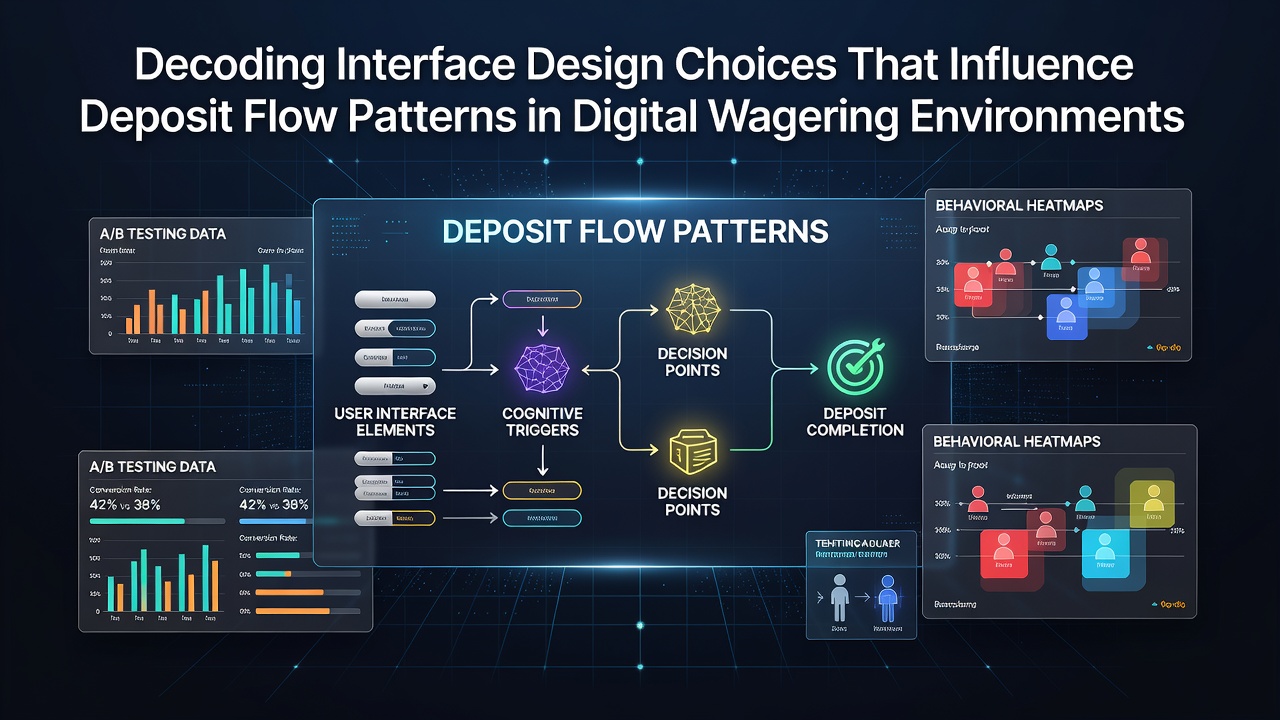
Digital wagering environments rely on specific interface choices that shape how users complete deposits, and analysts track these patterns through usage data collected across platforms in multiple regions. Button size, color contrast, and placement on screens influence the speed at which funding occurs, while researchers from the Ontario Institute for Studies in Education have documented correlations between simplified deposit flows and higher completion rates in controlled platform tests. Payment option layouts further direct attention, with prominent displays of e-wallets or cards leading users toward certain methods over others.
Core Layout Decisions That Guide User Actions
One-click deposit buttons positioned near account balances reduce the steps required to fund an account, and studies from the Australian Gambling Research Centre indicate that such placements increase transaction initiations by measurable margins in monitored sessions. Dropdown menus for currency selection appear less frequently in high-flow environments because direct toggles between options maintain momentum through the process. Color gradients on confirmation screens, often shifting from neutral tones to action-oriented hues, align with findings from visual attention tracking where users linger longer on highlighted elements before finalizing transfers.
Progress bars that fill incrementally during multi-step deposits provide visual feedback that keeps sessions active, whereas abrupt page reloads correlate with higher abandonment points in aggregated logs. Platforms that preload common deposit amounts based on prior activity patterns see repeated selections cluster around those presets, according to session data reviewed by European gaming technology researchers.
Payment Integration and Friction Points
Integration of saved payment methods allows accounts to bypass entry fields on subsequent visits, and this continuity contributes to steadier deposit volumes over time in environments where such features activate automatically. Security badges placed adjacent to input areas appear in many interfaces because they address hesitation documented in user behavior logs without adding extra verification layers. Mobile responsive designs that adjust field spacing for smaller screens maintain consistent flow rates across devices, while fixed desktop layouts sometimes create misalignment issues that slow entry sequences.
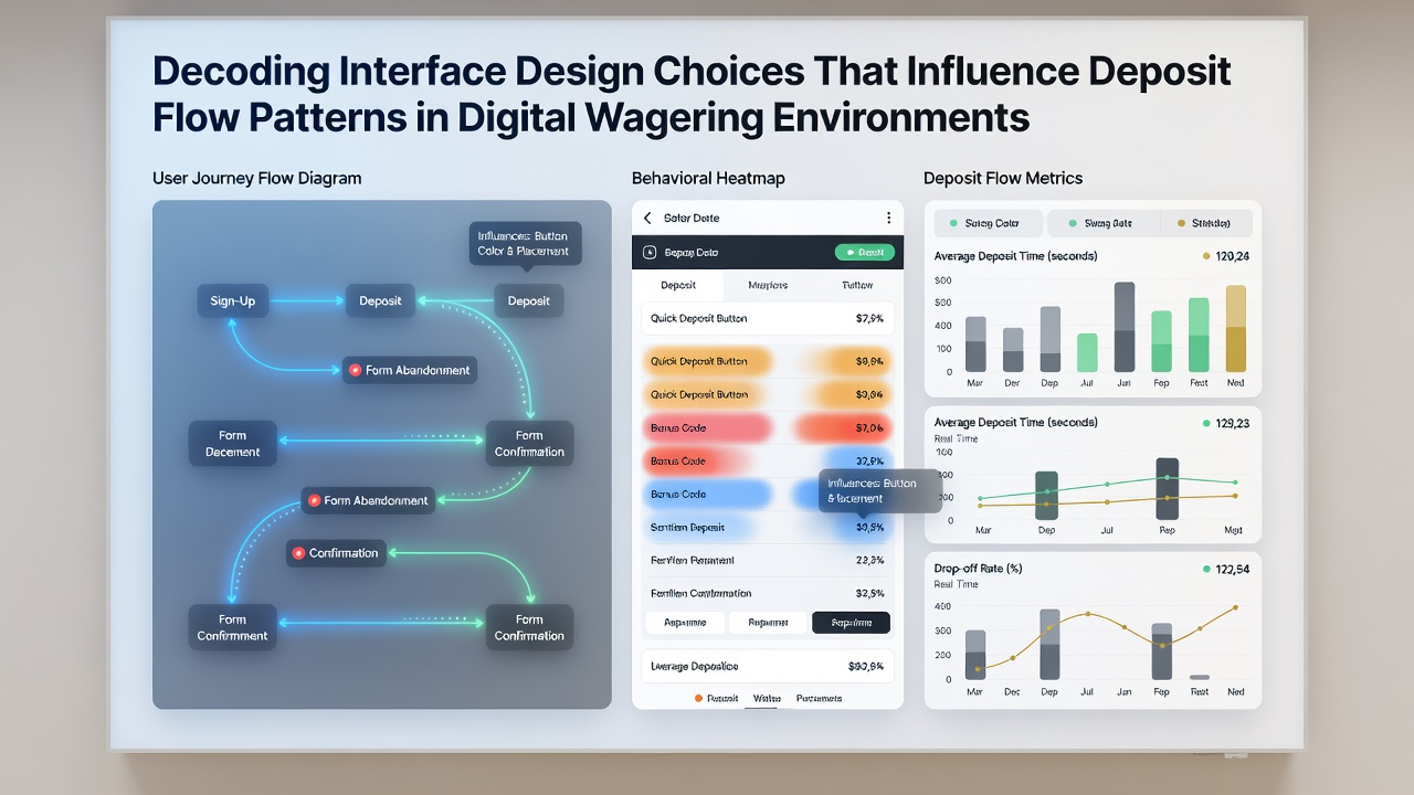
Notifications triggered after partial form completion prompt returns to unfinished deposits, and data compiled by Canadian regulatory bodies shows these reminders recover a portion of interrupted transactions when timed shortly after exit. Limits on visible processing fees during selection stages keep attention on the funding action rather than cost breakdowns that might prompt reconsideration. Auto-fill capabilities for address and card details, drawn from browser-stored information, streamline longer forms that otherwise require manual input across multiple fields.
Personalization Through Data Patterns
Algorithms that adjust displayed deposit limits based on individual account history create tailored pathways, and reports released in August 2026 from independent gaming technology assessments highlight how these adjustments align suggested amounts with observed spending rhythms. A/B testing of alternative menu orders reveals that reordering payment icons changes selection distributions, with users favoring items shown first in vertical lists. Dynamic elements that expand recommended funding sources after initial logins build on prior choices without requiring new selections each time.
Session timers displayed subtly near deposit windows appear in some platforms to maintain awareness of elapsed time, yet their presence does not alter completion rates according to comparative platform audits conducted across North American and Asia-Pacific operators. Background animations during loading periods between screens reduce perceived delays, and interface logs indicate users tolerate longer processing intervals when such visual continuity remains active.
Regional Variations in Design Application
European platforms often incorporate standardized icon sets for payment types that match regulatory display requirements, whereas North American environments prioritize branded logos that reinforce recognition. Australian operators have tested localized language prompts within deposit flows that reference common banking terms, leading to faster recognition of options in tracked user groups. These adaptations reflect broader patterns where interface elements adapt to regional payment norms without changing core functionality.
Conclusion
Interface design choices continue to shape deposit patterns through measurable interactions between visual cues, layout sequencing, and personalization features. Data collected across platforms demonstrates consistent effects from specific elements such as button placement and progress indicators, while ongoing assessments in August 2026 and beyond track how these choices evolve alongside new device capabilities and user expectations. Observers monitoring these trends note the role of empirical testing in refining flows that maintain steady transaction volumes across varied wagering environments.